Branding, themes, and layout
Logo, colors, panel widths, an About dialog, and the empty-state landing page are configured from Python, and so is the viewer layout, so a deployment can be rebranded without touching the browser client.
Branding
Use local image files for the header logo and browser favicon, and customize the initial file-loading screen:
from imfusion_webappkit import BrandingConfig, ImFusionWebApp


webapp = ImFusionWebApp(
    title="Spine Planner",
    branding=BrandingConfig(
        logo="assets/company-logo.svg",
        favicon="assets/favicon.ico",
        landing_page_title="Welcome to Spine Planner",
        landing_page_message="Choose a scan or drag it here",
    ),
)

Relative asset paths are resolved from the process working directory. title
remains the browser tab title and is used as the logo's accessible alternative
text.
Information dialog
Add a generic information button to the application header with InfoConfig.
Its content supports Markdown, making it suitable for project descriptions,
instructions, contact details, citations, and links:
from imfusion_webappkit import ImFusionWebApp, InfoConfig


webapp = ImFusionWebApp(
    info=InfoConfig(
        button_label="About",
        title="About this demo",
        content="""
This demo presents our **image segmentation algorithm**.

- [Read the paper](https://example.com/paper)
- Contact: research@example.edu
""",
    )
)
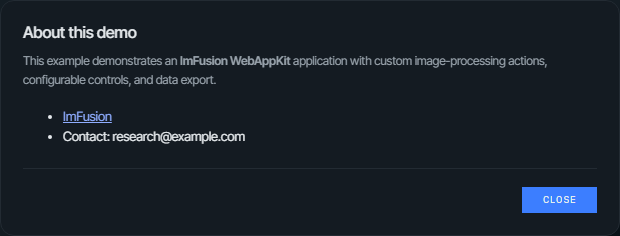
Leave info unset to omit the button. The Markdown is rendered without raw
HTML support.
Theme
Choose one of the built-in DARK, GRAY, or LIGHT presets and override only
the semantic values needed by the application:
from imfusion_webappkit import ImFusionWebApp, ThemeConfig, ThemePreset


webapp = ImFusionWebApp(
    theme=ThemeConfig(
        preset=ThemePreset.LIGHT,
        primary="#005f73",
        primary_hover="#004c5c",
        font_family="Inter, system-ui, sans-serif",
    ),
)
The presets differ in their backgrounds, surfaces, text, and status colors. The
default DARK preset tints its chrome towards the brand blue, GRAY keeps the
same surface steps in neutral grey so the accent is the only color on the page,
and LIGHT inverts both. Starter projects from imfusion-webappkit init use
DARK unless --theme selects another preset:
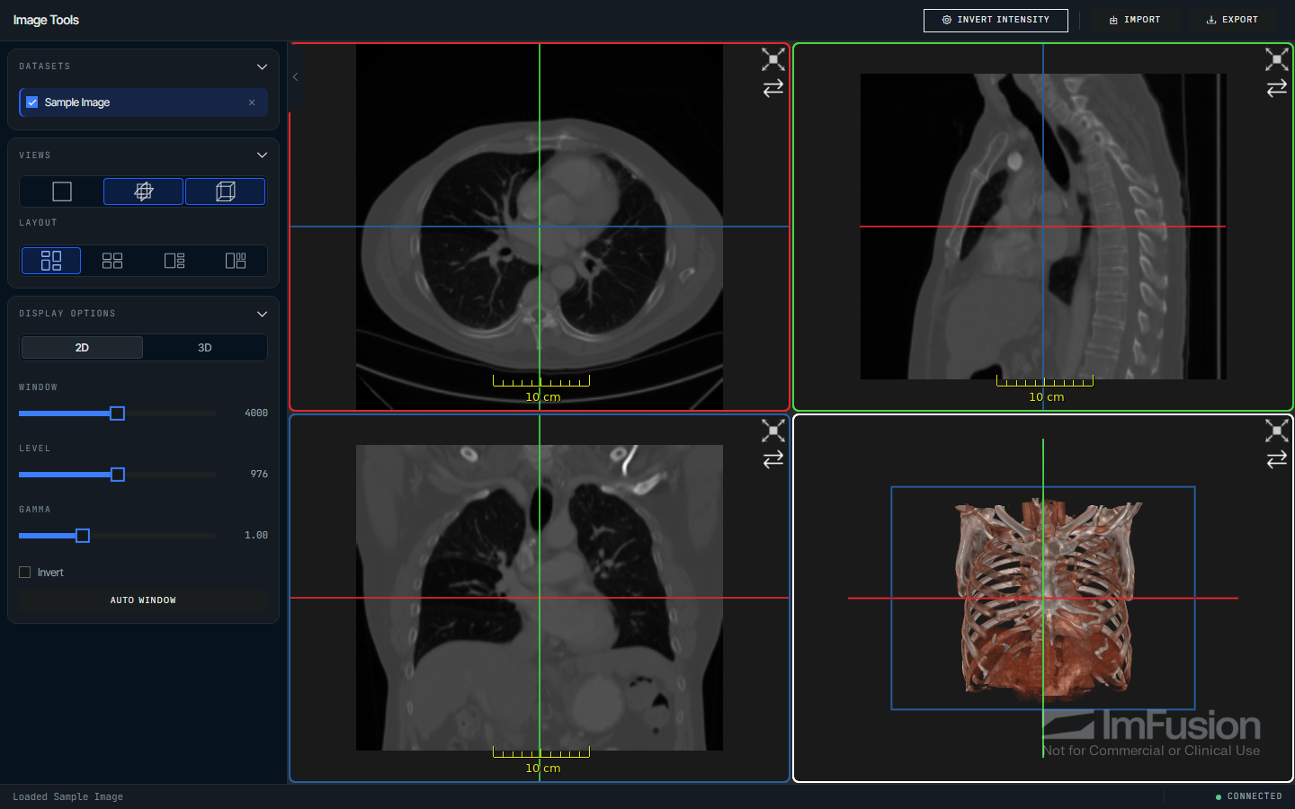
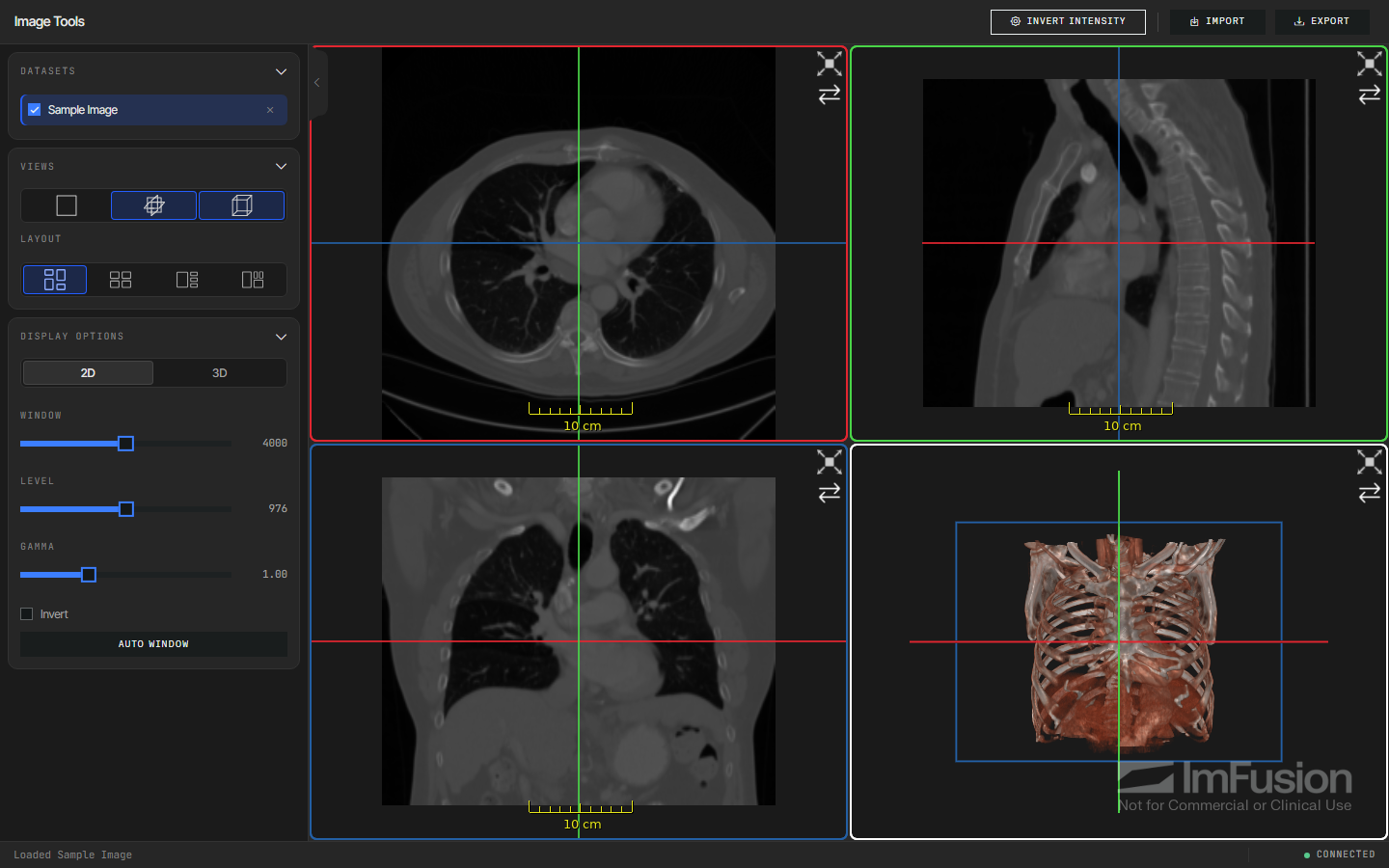
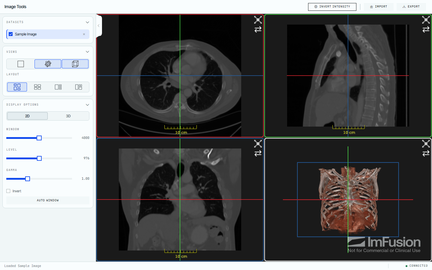
Theme overrides include primary and secondary colors, backgrounds and surfaces, text colors, border and status colors, and the font family.
Sidebar
SidebarConfig controls the standard viewer panels:
from imfusion_webappkit import SidebarConfig


sidebar = SidebarConfig(
    show_datamodel=True,
    show_views=True,
    show_display_options=False,
    collapsed=False,
)
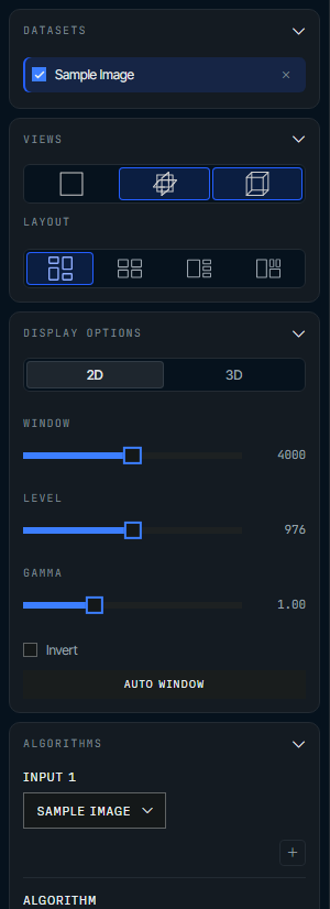
Pass sidebar=None to hide the sidebar. Set
algorithm_selector="sidebar" on ImFusionWebApp to show the Algorithms panel,
or use "header" to expose it as a header button. Dedicated algorithms exposed
with app.register(..., algorithm=..., placement=...) support the same options.
Page and viewer layout
Configure panel placement and width, status-bar visibility, and the initial Web SDK view arrangement:
from imfusion_webappkit import (
    ImFusionWebApp,
    LayoutConfig,
    SidebarConfig,
    SidePosition,
    TitlePosition,
    ViewLayout,
    ViewType,
)


webapp = ImFusionWebApp(
    sidebar=SidebarConfig(),
    layout=LayoutConfig(
        header_title_position=TitlePosition.CENTER,
        header_logo_position=SidePosition.LEFT,
        sidebar_position=SidePosition.RIGHT,
        sidebar_width=280,
        sidebar_resizable=True,
        workflow_panel_position=SidePosition.LEFT,
        workflow_panel_width=320,
        workflow_panel_resizable=False,
        show_status_bar=False,
        initial_view_layout=ViewLayout.FOCUS_PLUS_ROWS,
        initial_visible_views=(ViewType.TWO_D, ViewType.MPR, ViewType.THREE_D),
    ),
)
The header always displays the application title, including when a branding
logo is configured. The title defaults to left and can also be positioned at
center or right; the logo defaults to left and can be positioned at
right. Panel positions are left or right; widths must be between 180 and
640 pixels.
The sidebar and the workflow panel are resizable by default, which makes their
configured width the initial width only: users can drag the inner edge of a
panel to resize it within the same 180–640 pixel range, double-click the edge to
restore the configured width, or use the arrow keys once the handle is focused.
Growing a panel additionally stops once the viewer area would shrink below 240
pixels, and widths are not persisted across page reloads. Set
sidebar_resizable=False or workflow_panel_resizable=False to pin a panel to
its configured width.
Supported initial view layouts are Auto, Rows, FocusPlusStack, and
FocusPlusRows. Visible views may contain 2d, mpr, axial, coronal,
sagittal, and 3d. mpr enables all three orthogonal MPR views together.
Leave either initial viewer option unset to retain the Web SDK default.
Plain string values are also accepted and normalized to the corresponding enum.